Name: Liberty Middle School Website - Concept
Client: Liberty Middle School
Category: HTML and CSS programmed Website
Date: July 4, 2002
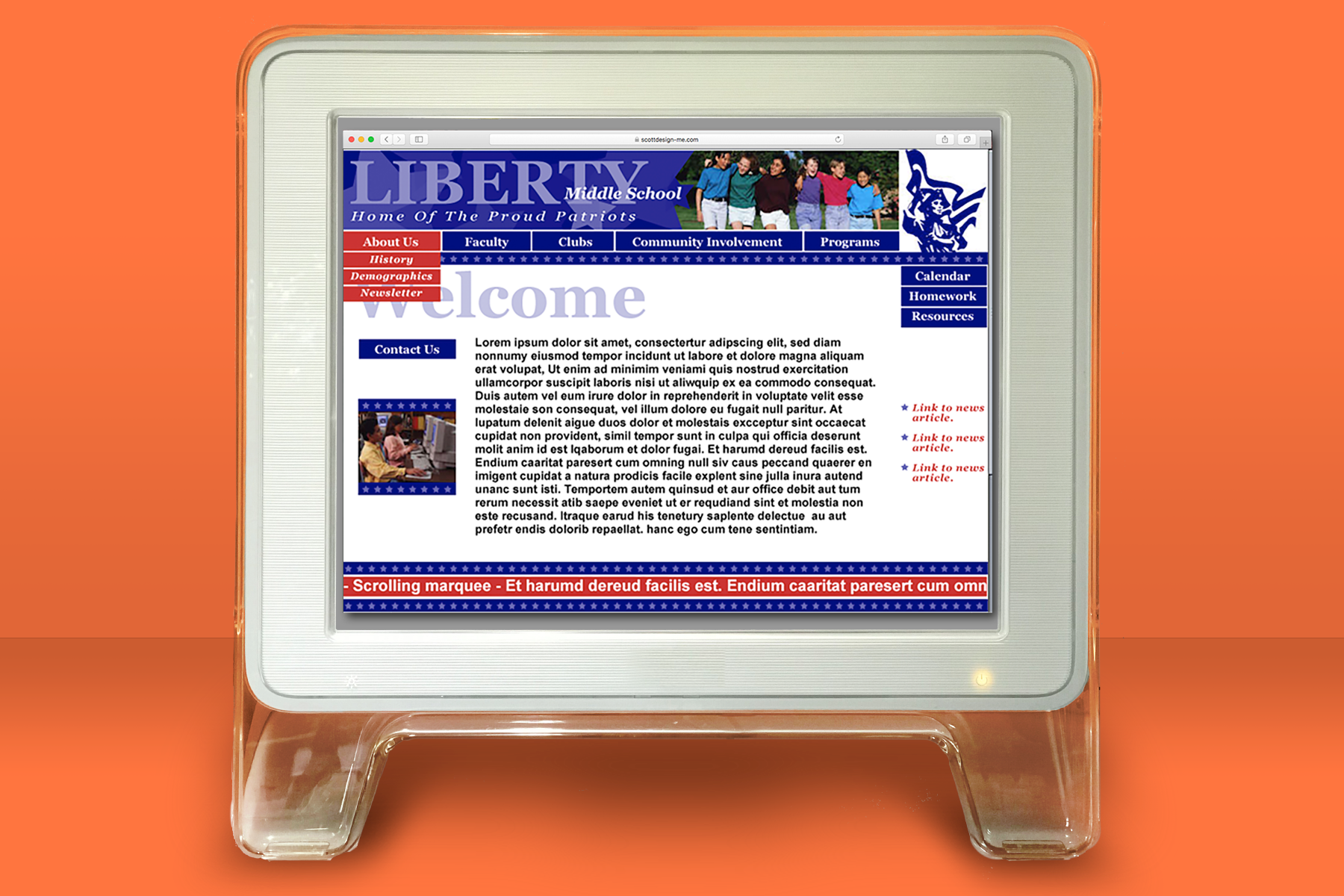
This site is the first attempt for the school to have a Website. The biggest challenge was to organize a lot of information organized in a way so teachers, students, and parents. We did this by creating CSS drop-down menus to compartmentalize information, making it easy to find. We also added a ticker-tape effect at the bottom of the home page bringing attention to important news and events.
Scrolling through the screen samples the following features were used:
- Home page showing the organized functions of the menus along the top and quick links on the right allowing a quick way for students to access the info quickly they need for homework and resources from each teacher.
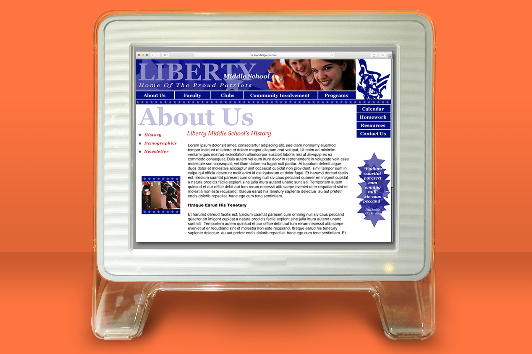
- Secondary page layout showing how the menu continues to be along the top of the page with a large header on each page, so the user knows where they are in the Website. The left side changes to showing submenus of the subject allowing the user to quickly go to subsections without going to search through the dropdown menus.
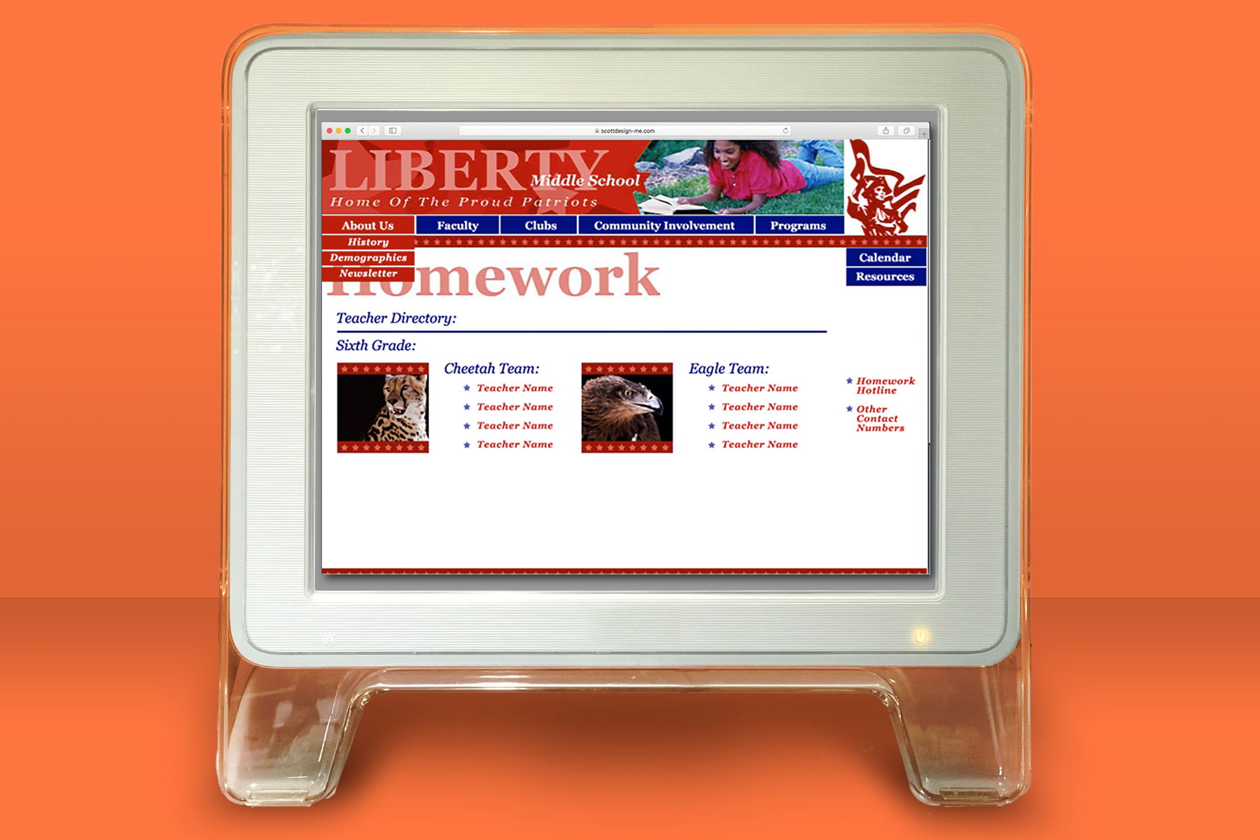
- This Page also shows how the student section would be organized by teams and quick links to the teachers in each team.


